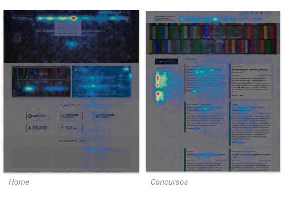
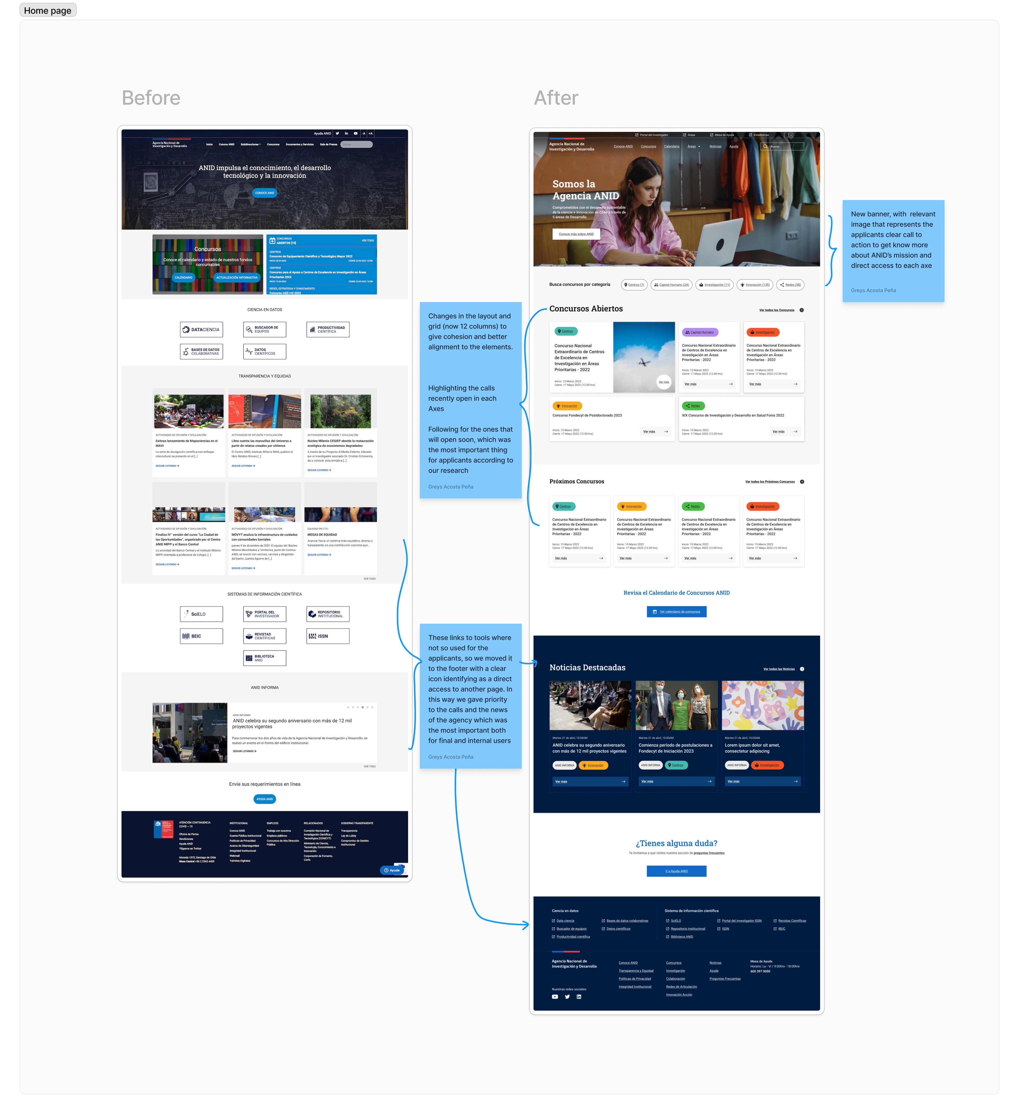
The first thing we did was an analysis of ANID’S home page in terms of content and informational architecture :
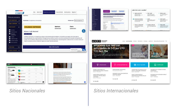
We decided to review other Websites, to understand what were common patterns and best practices. Our main gateway from this was that the new platform should present ANID in a clear and friendly way, helping new users to understand what ANID is and what services offers and at the same time it should solve current users pain points, giving better visibility to the information they most seek today.
💡 Insight: Use descriptive text to help new users identify the 5 different axes and what they can find in each one with a language that speak directly to them.
Then we decided to create the first sketches and prototypes of the new website in order to go out and test with users the first look of how we will show the information. Prioritizing 5 pages the Home page, the finder for calls/ funds, the call detail page, calendar and the about page according to insights that we got from the previous research. We tested with 5 users and did a workshop with 40 internal workers of ANID to get to know their opinions on how to redesign the platform.
Our main insights were:
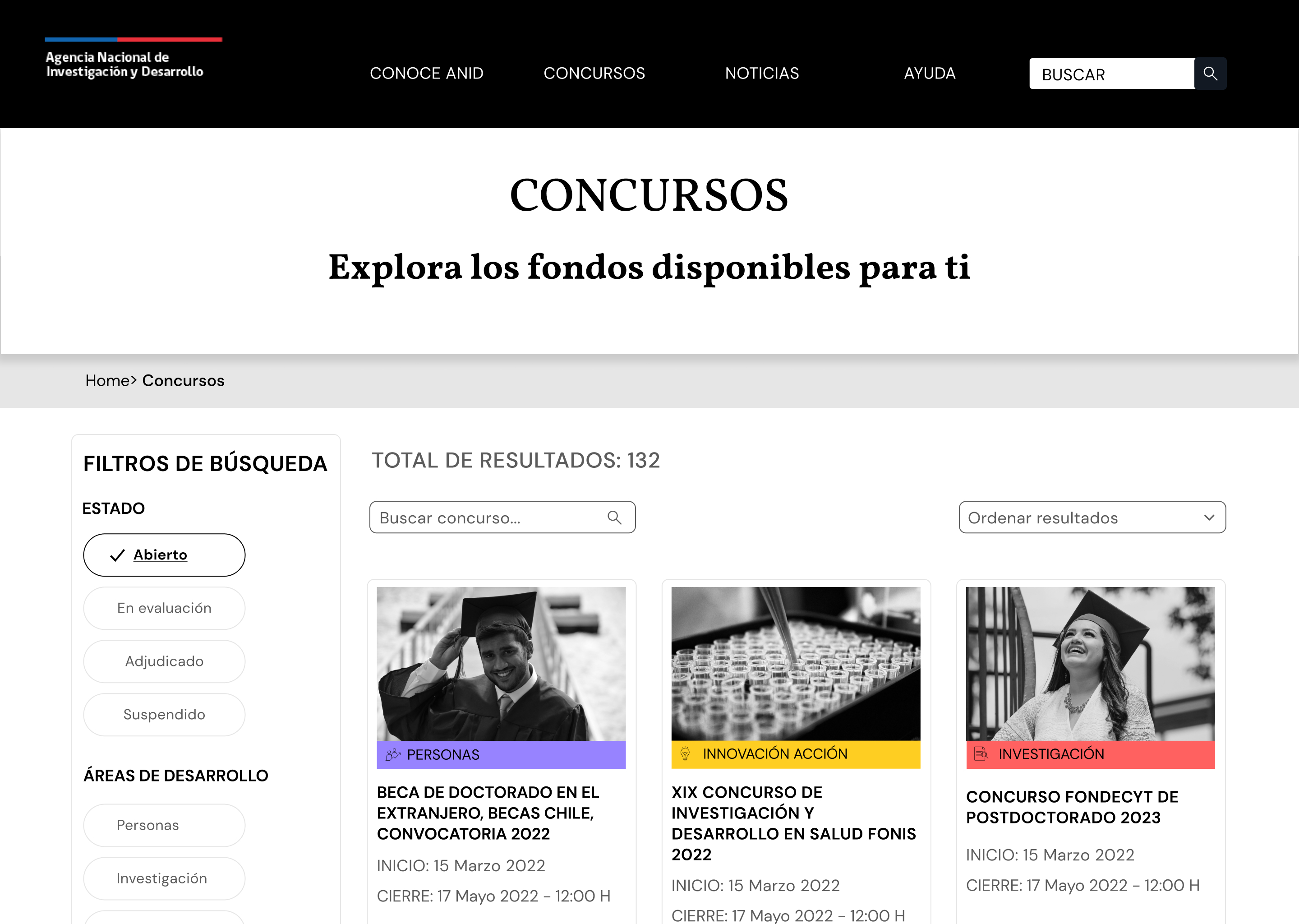
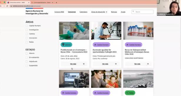
💡 Insight: During the test with users we discovered that the most relevant pages for them were the finder for calls/ funds, the call detail page and the calendar.
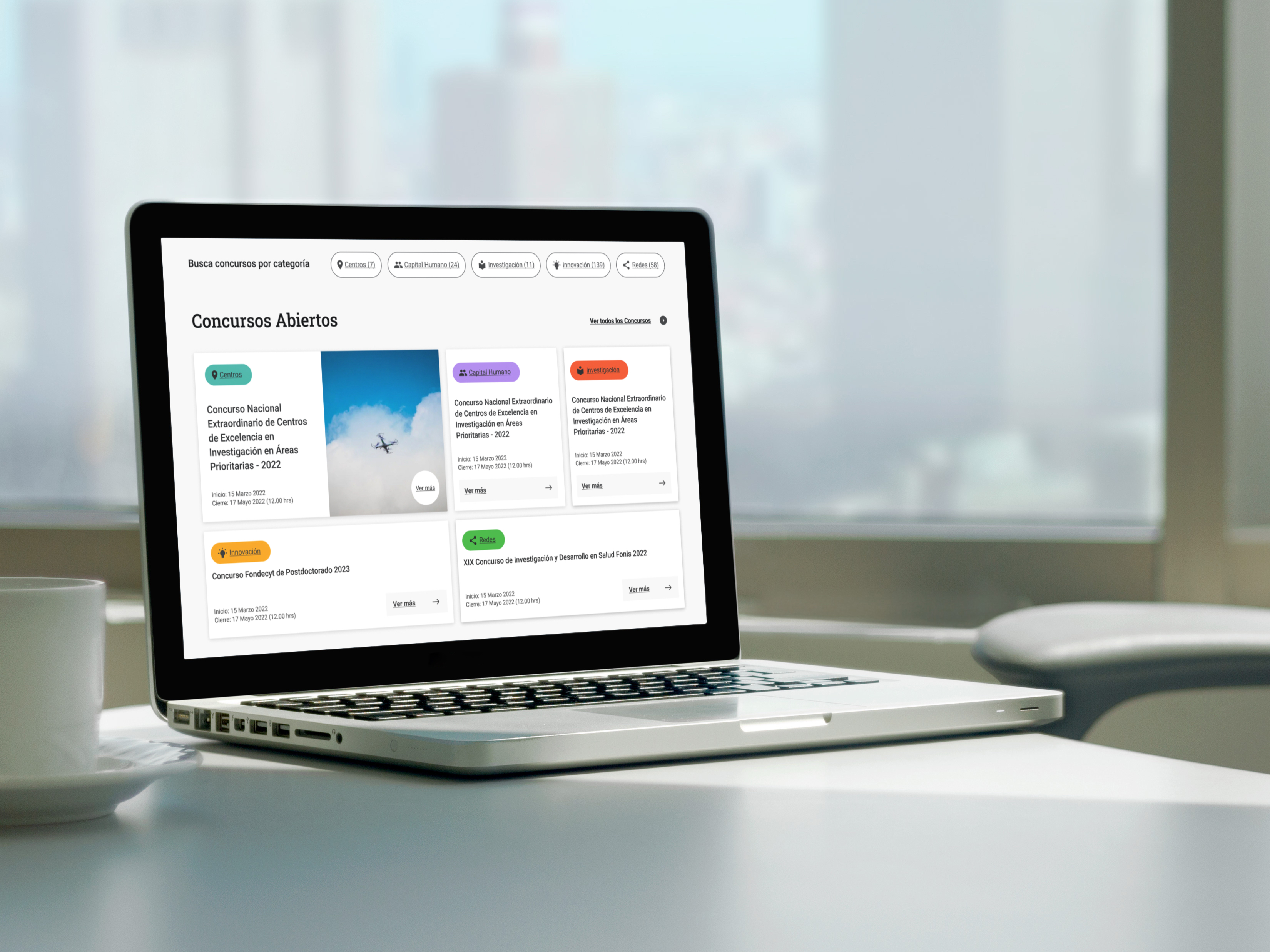
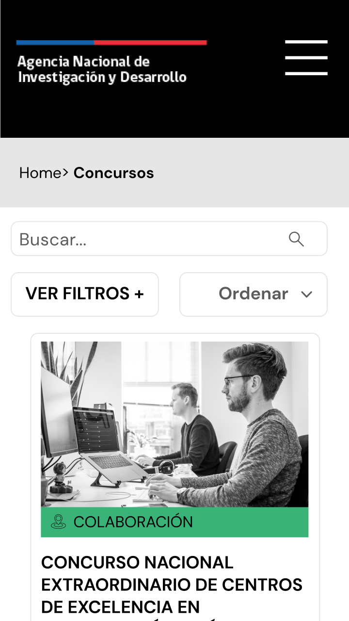
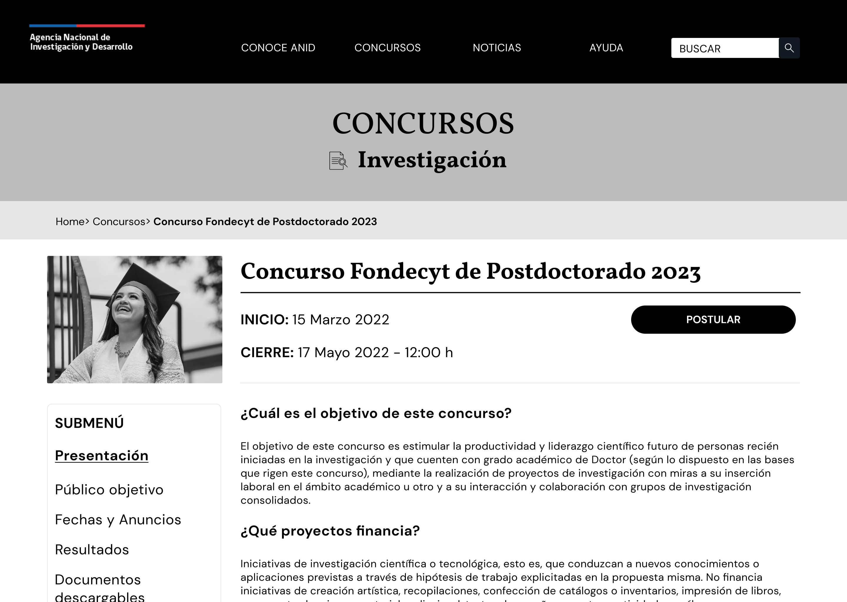
Desktop Prototype
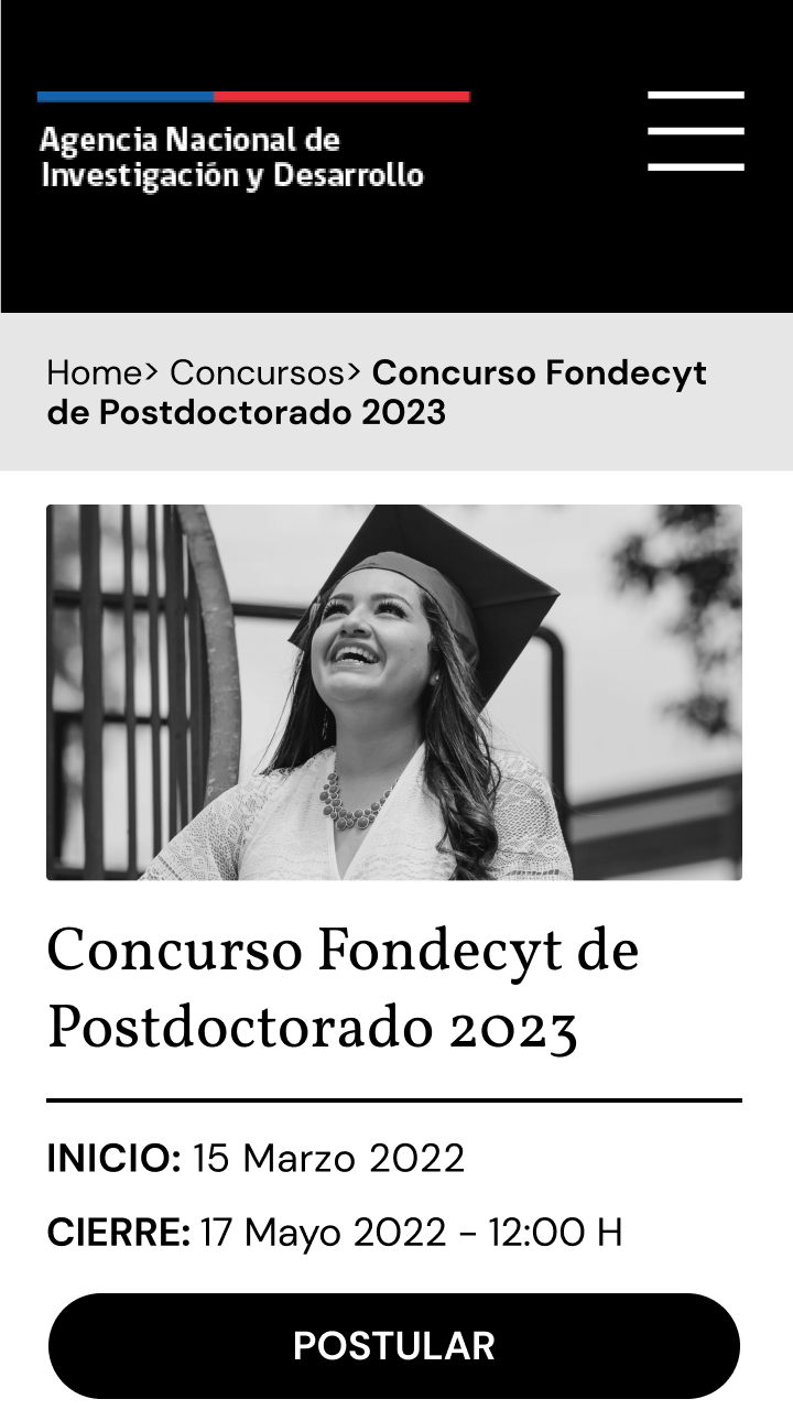
Mobile Prototype
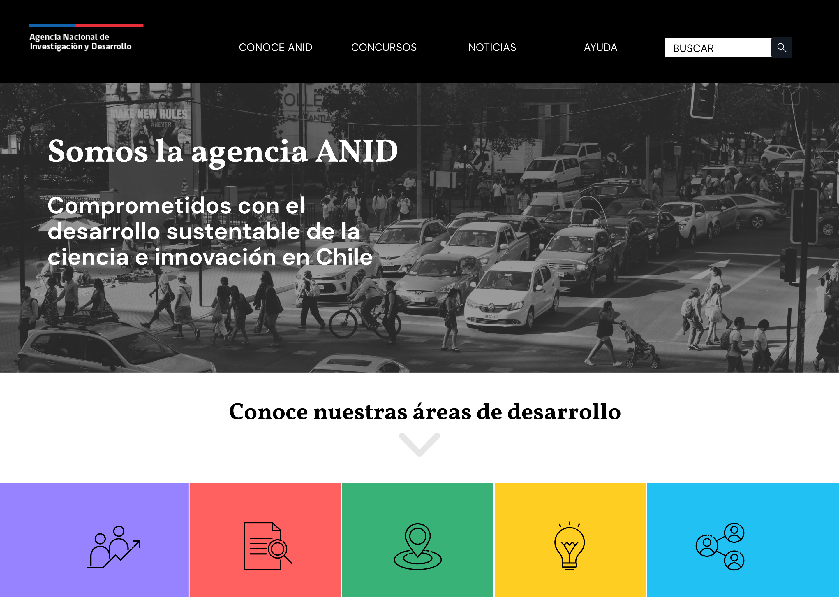
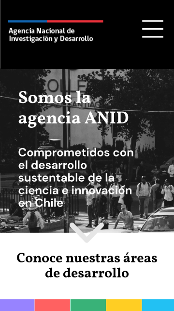
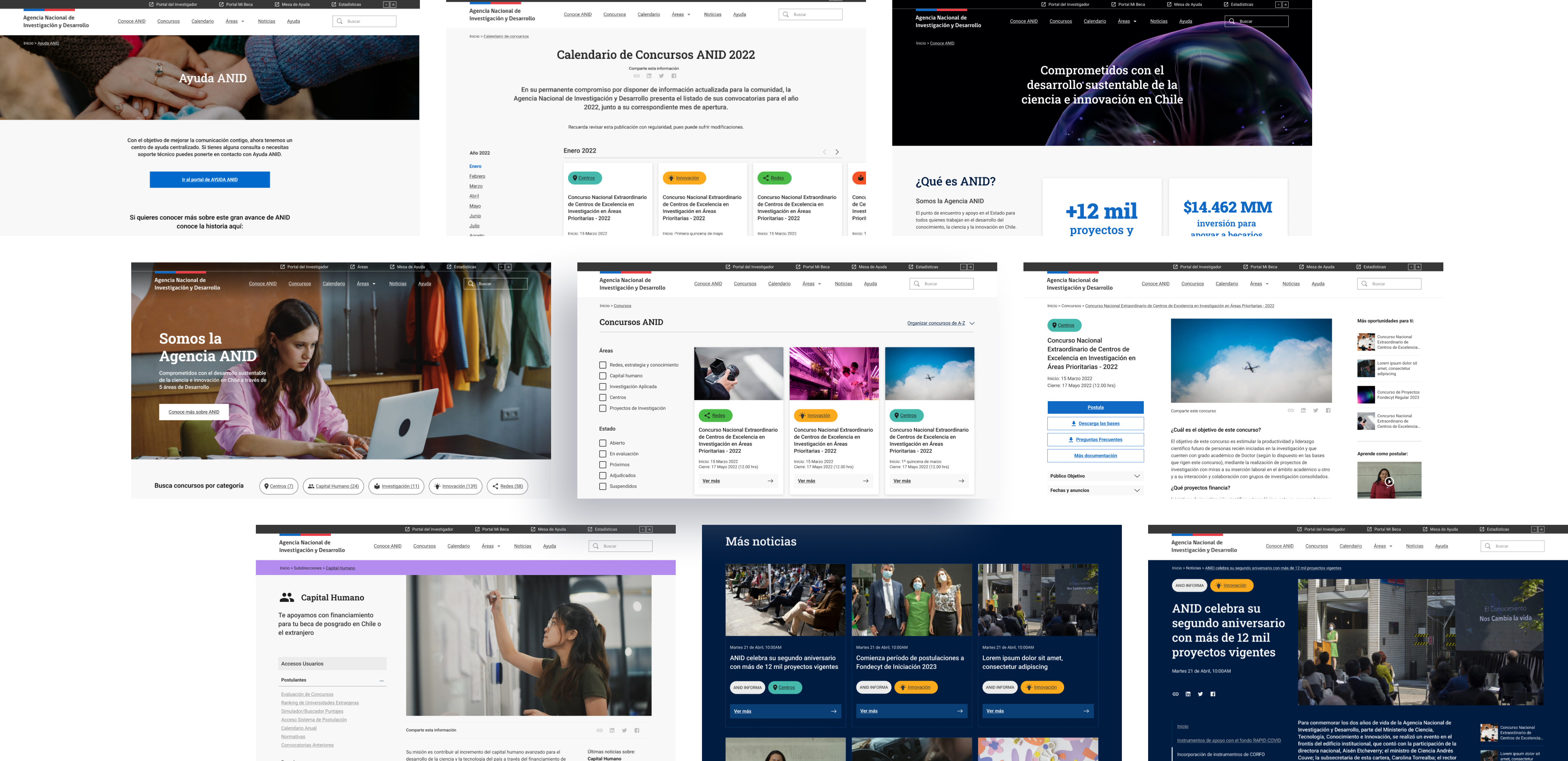
With these insights in mind we defined better the look of the platform, following gob.cl design system. Once we had the final proposal we gather feedback from ANID’S community trough a Typeform form and 5 usability test with final users.
Our main insights were:
The result of the project was the creation of a new ANID platform that successfully prioritizes content important to users. The homepage was simplified, and elements were reduced to align with user preferences. The new interface also adheres to Chilean government platform rules for accessibility.
 Take a closer look at the comments on Figjam
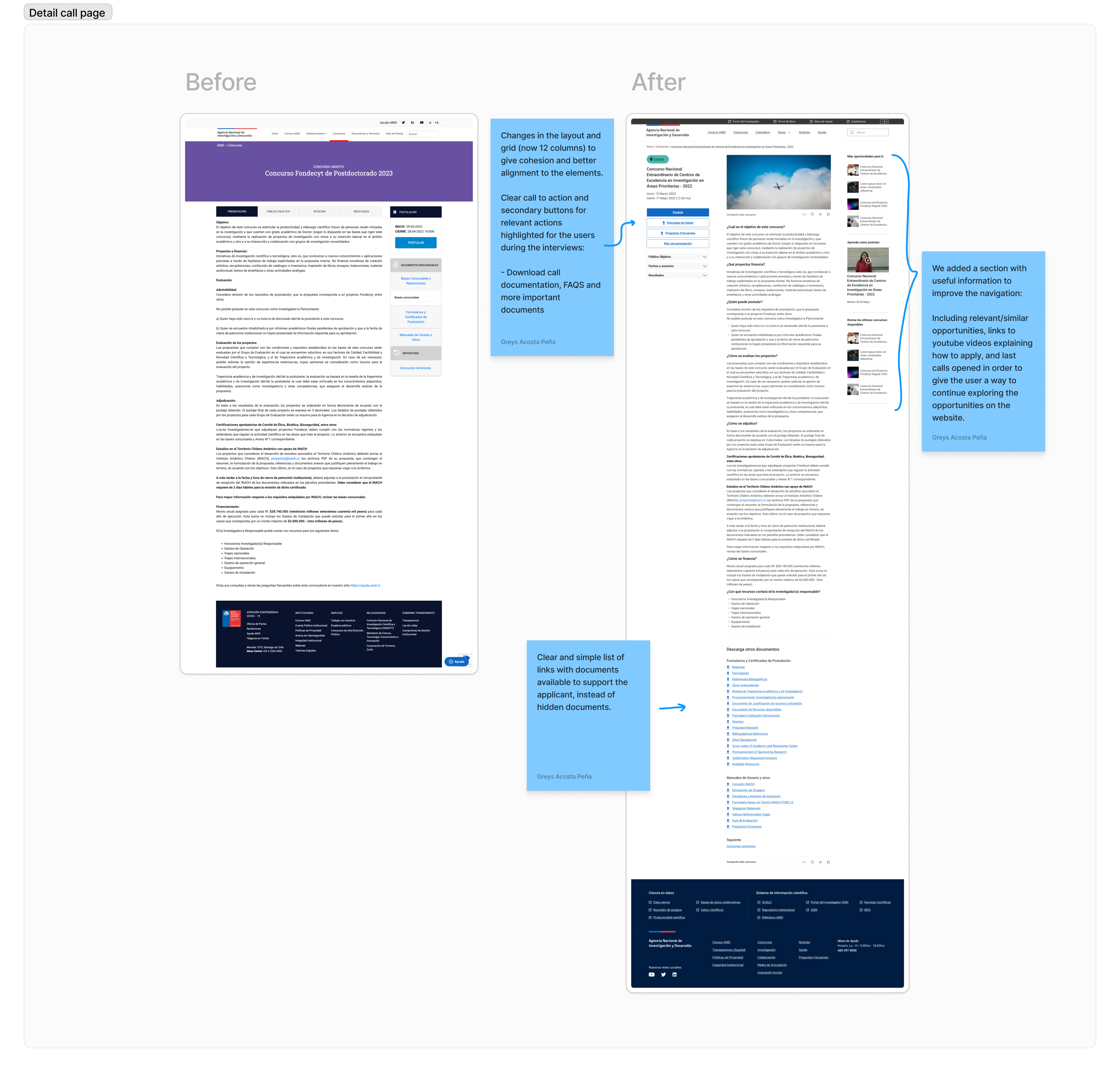
The following video was used to present the MVP of the website to different stakeholders, and gather feedback before implementing and doing the migration of the new design to ther servers.
The cumulative effect of these improvements is evident in the notable reduction in deskcall inquiries, as users now have clearer access to the resources they need to apply for calls. We believe these changes will not only enhance user satisfaction but also contribute to increased efficiency in the internal team.
If you like what you see and want to work together, get in touch!
greyspacosta@gmail.com