
Our research identified three main issues with the current website:
How can we make the Fithub website more accessible, relevant, and user-friendly for navigation?
%2010.50.18%20a.m..png) Take a closer look at the wireframes on FigJam
Take a closer look at the wireframes on FigJamI considered comments from social media channels to understand users' main pain points and identify missing functionalities in the product.
I conducted remote user testing sessions to gain a deeper understanding of how users were interacting with the website and gathered their feedback.
Subsequently, we converted insights into actionable steps, prioritizing them based on impact and feasibility:
We compared our approach with direct competitors and international references to gather insights for redesigning different components.
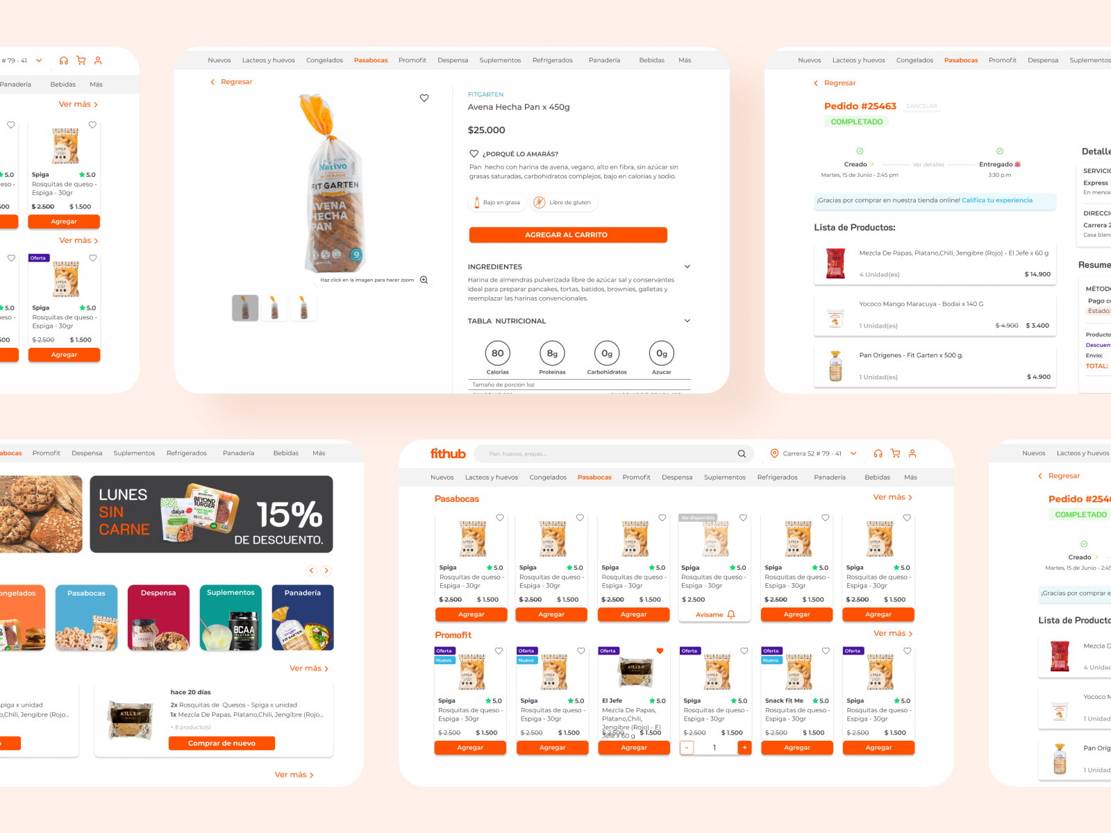
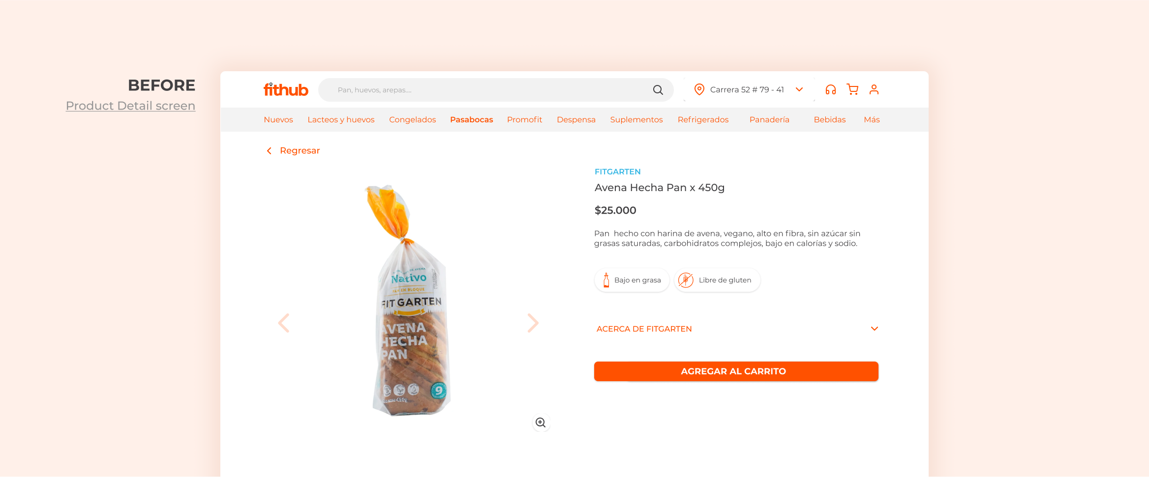
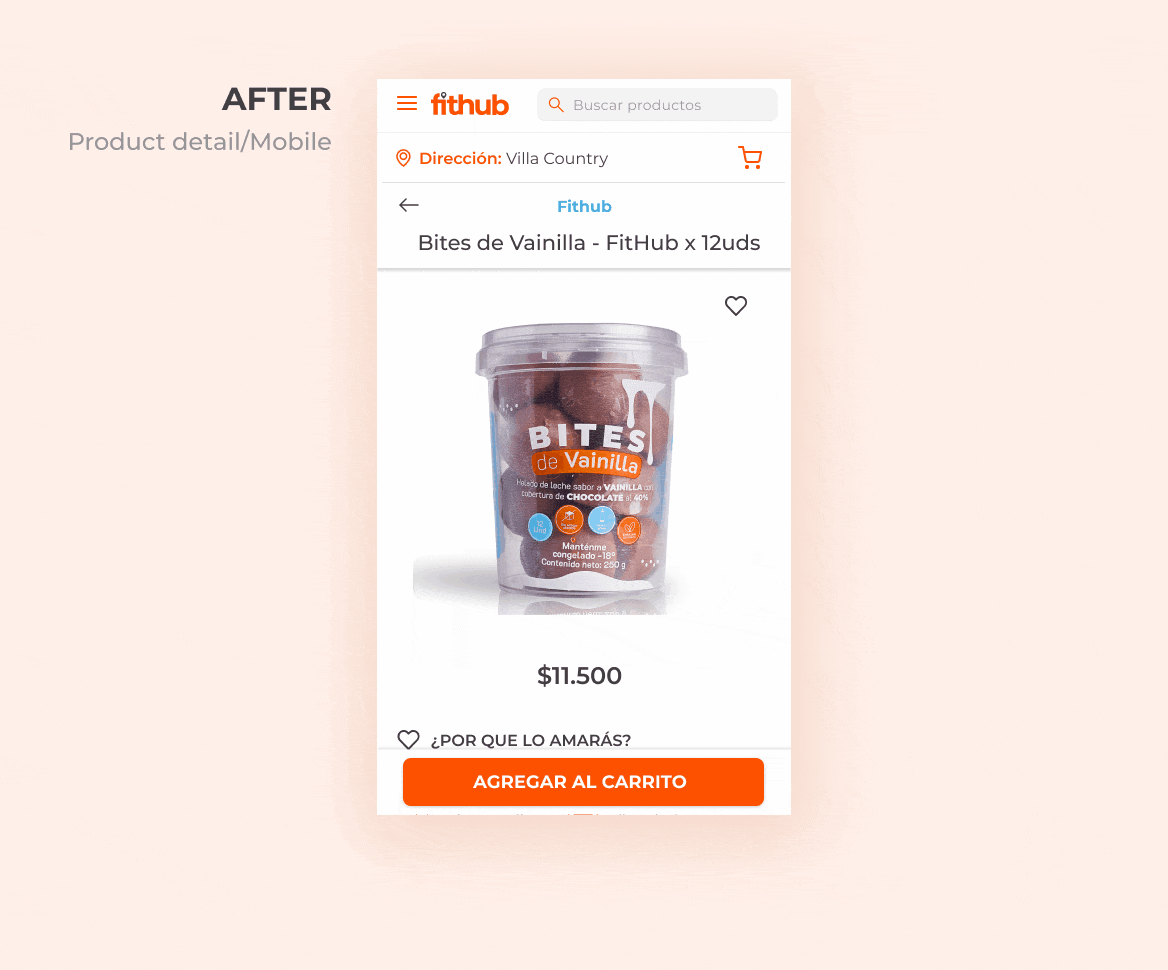
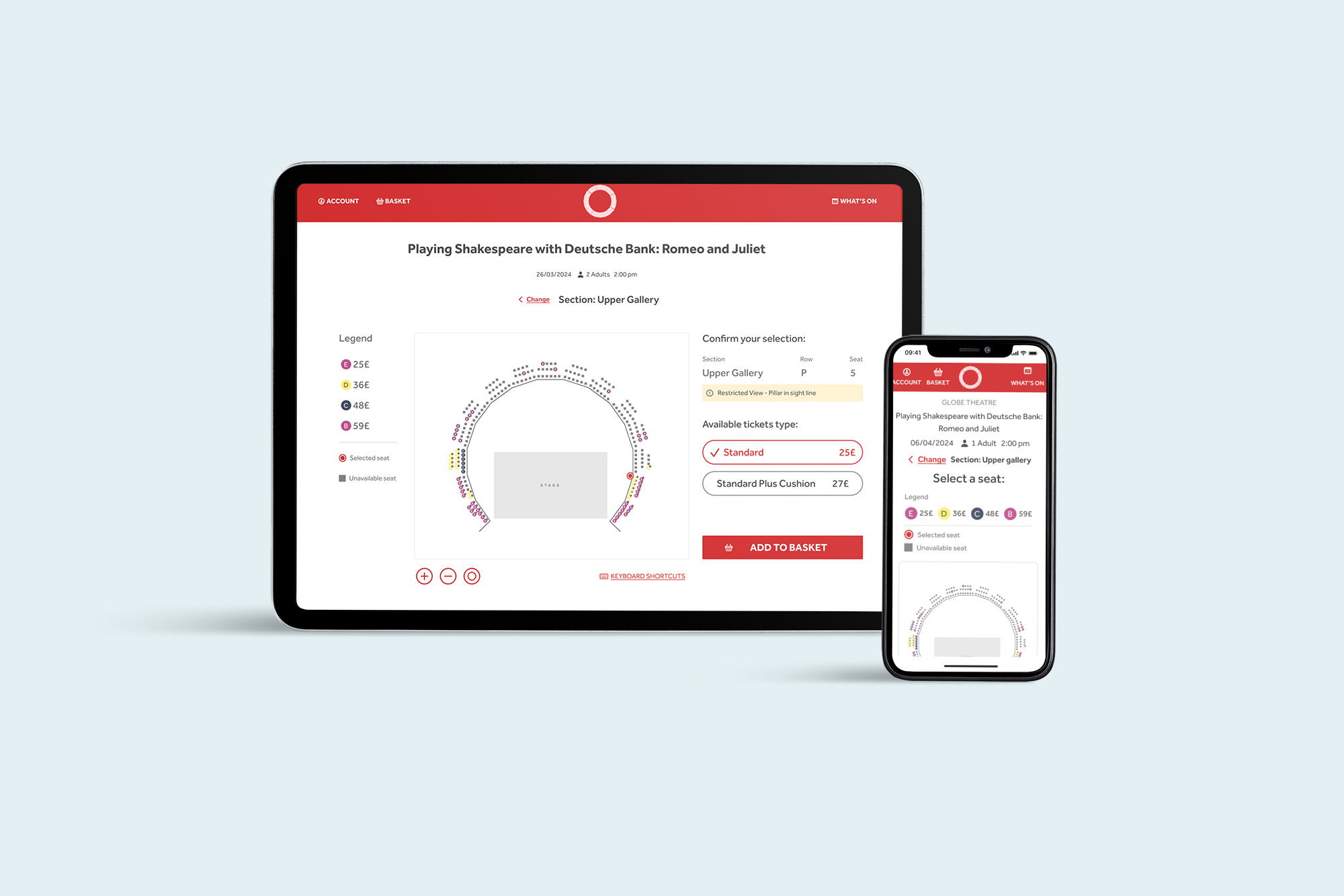
The new product detail page underwent several iterations before we finalized the design.
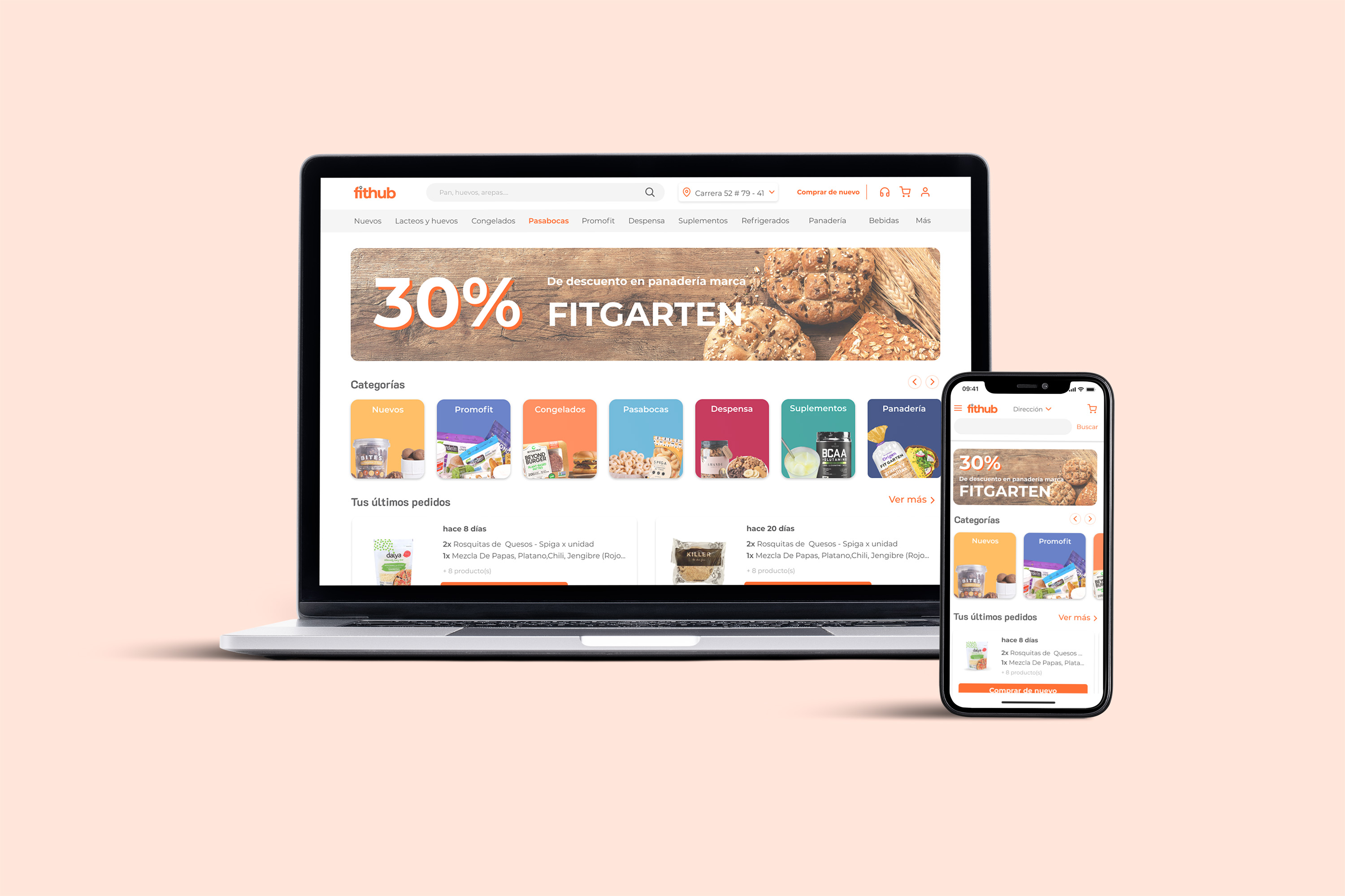
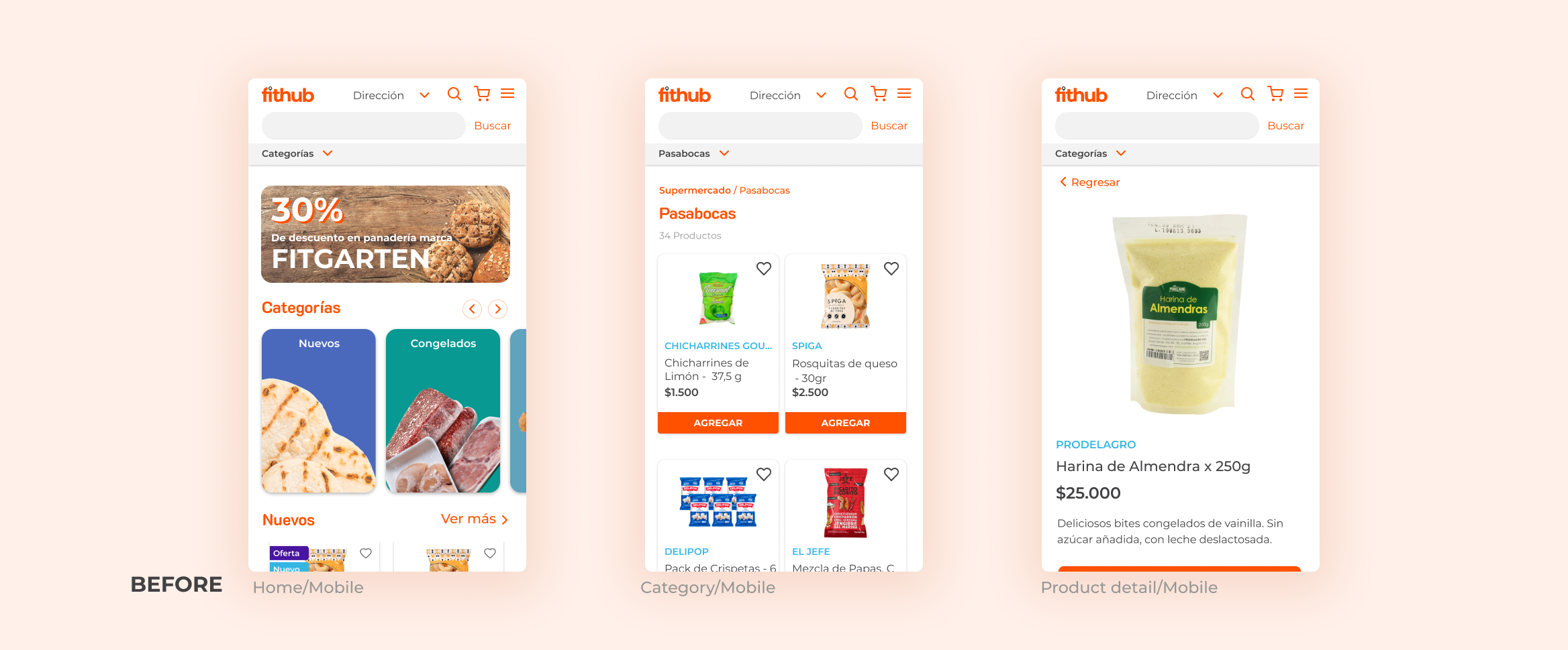
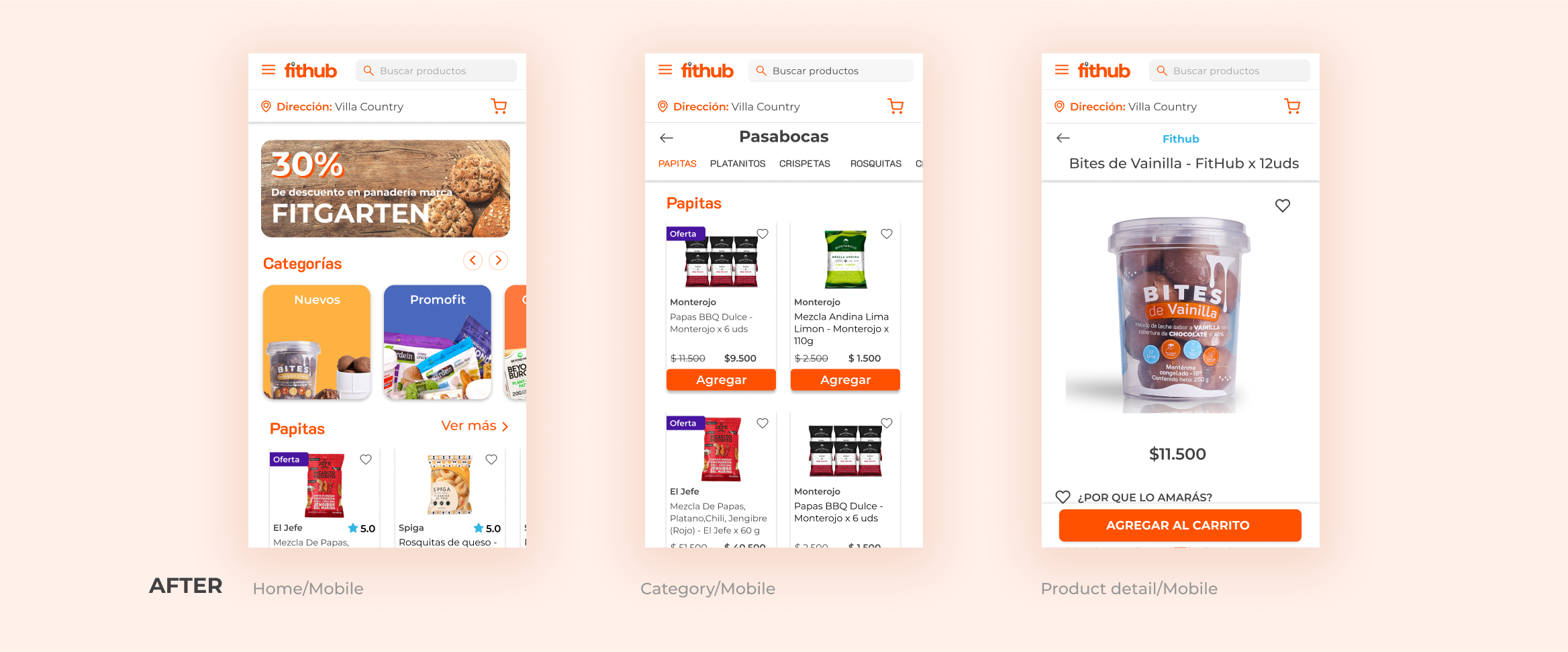
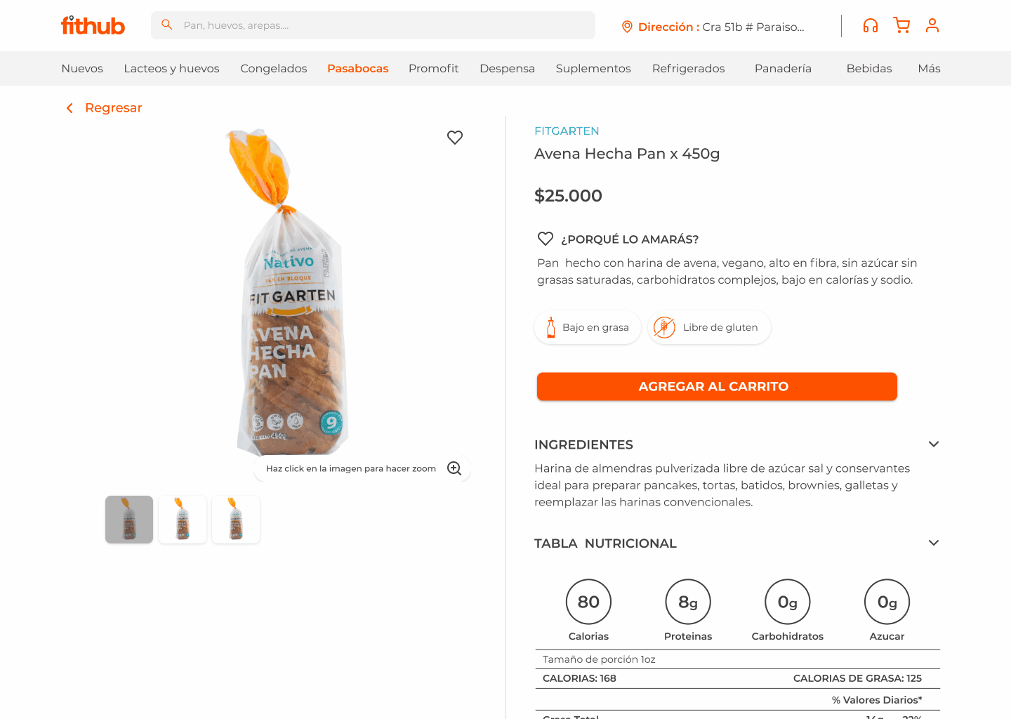
The desktop experience remained largely unchanged, with a reduction in the use of the orange color, which now indicates action or active pages. Categories were visible in the header, and hovering revealed subcategories in each one. Once in a category, products were listed, divided by subcategory.
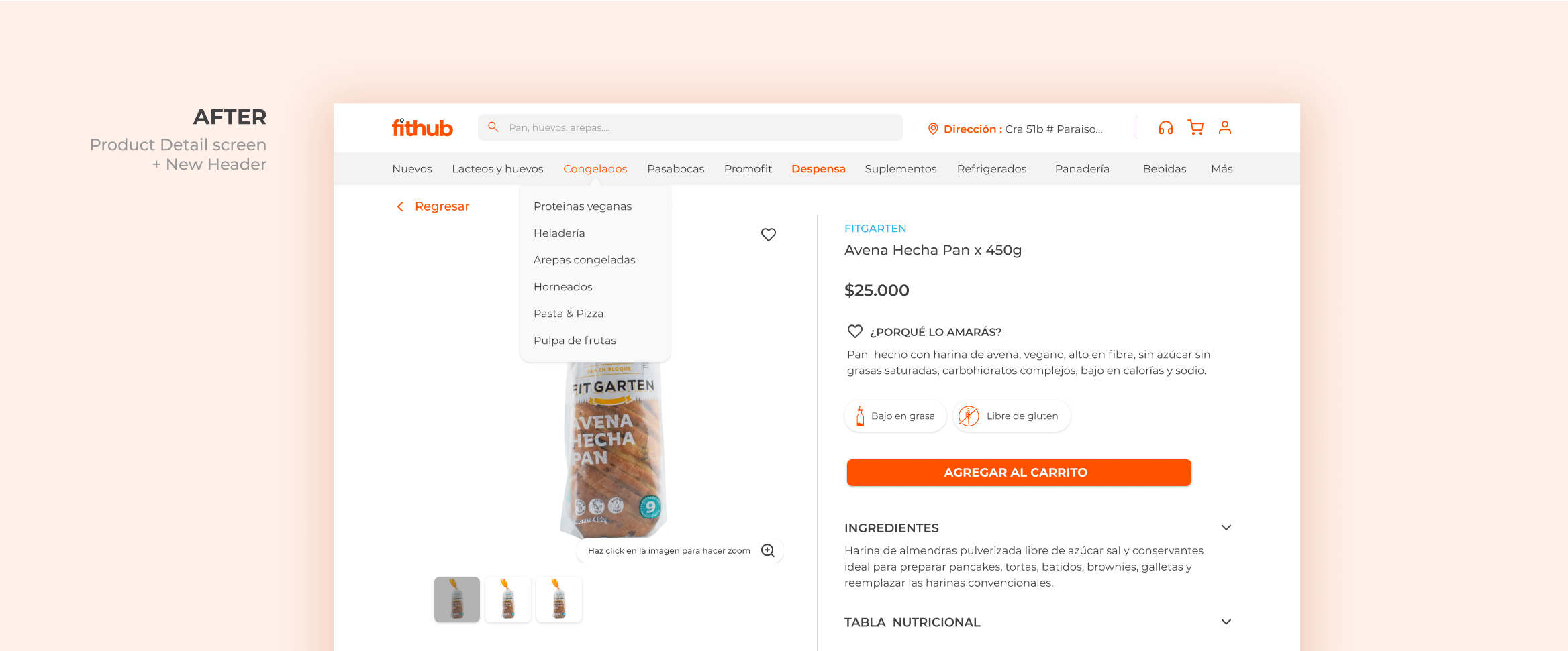
We moved the hamburger icon to the left, following usage patterns from other websites. The category bar was removed from the home page since more users interacted with the categories section. Upon entering a category, the header expanded, providing easy access to subcategories.
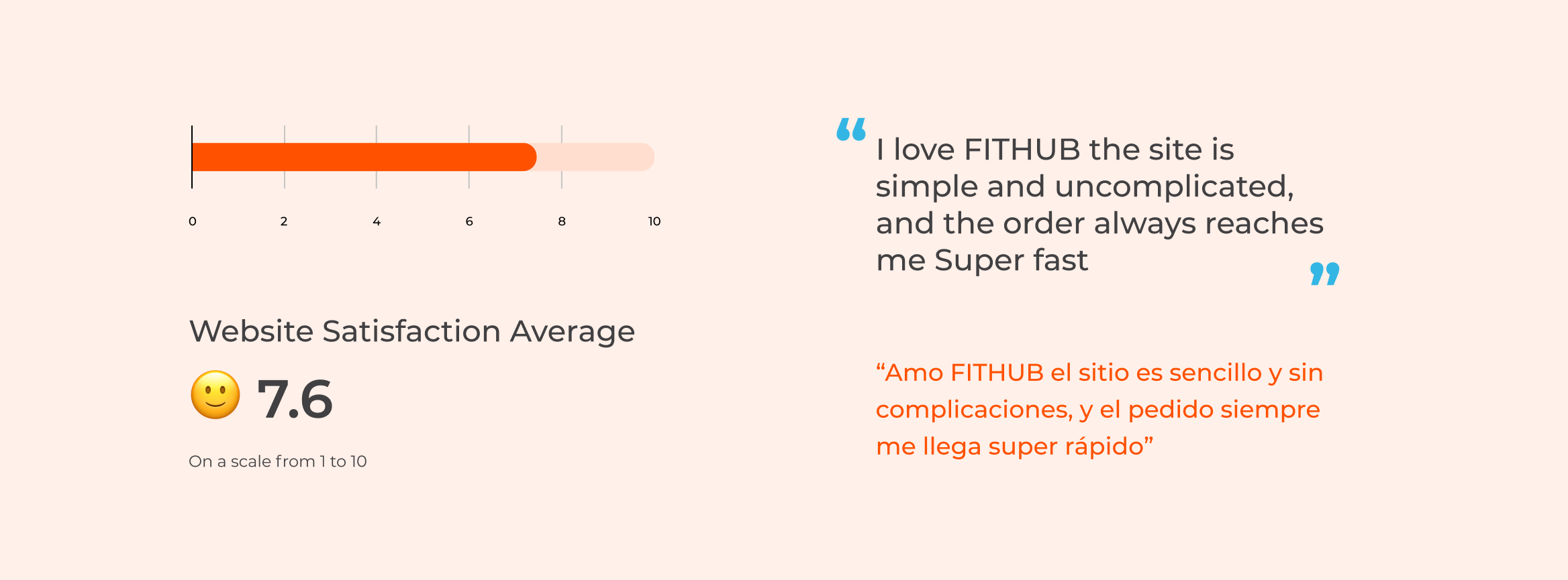
Users expressed an overall positive opinion of the website redesign, describing it as fast, simple, and easy to use.
If you like what you see and want to work together, get in touch!
greyspacosta@gmail.com