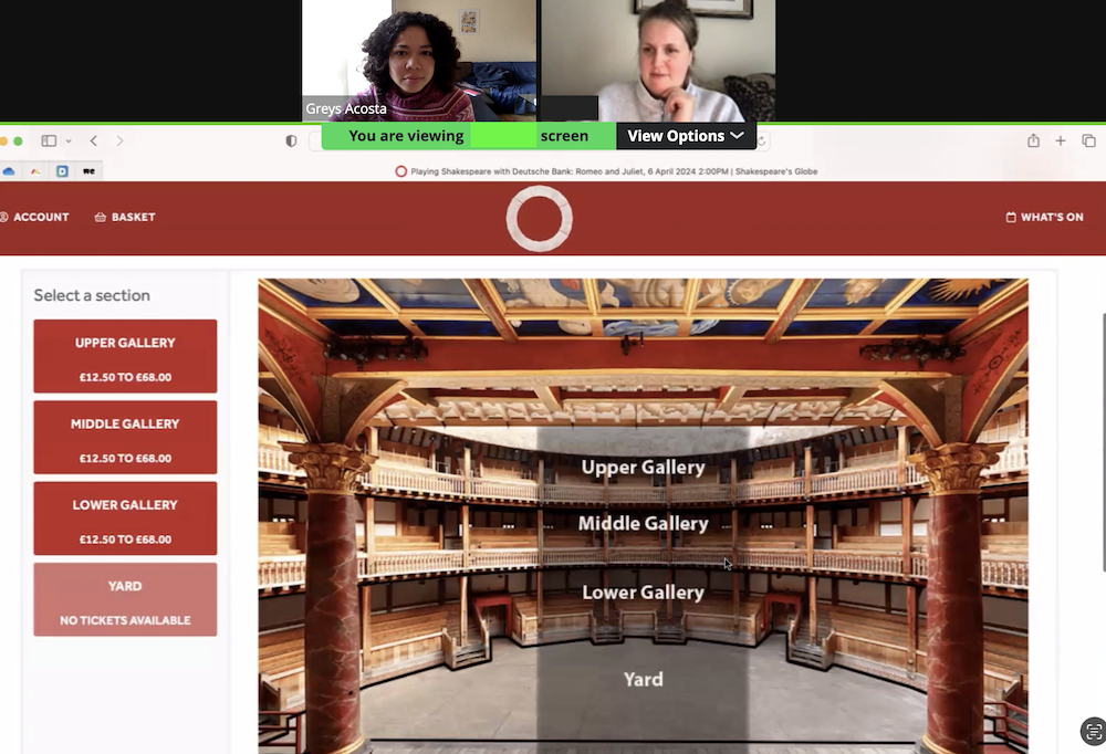
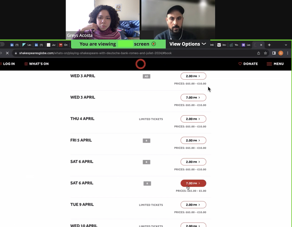
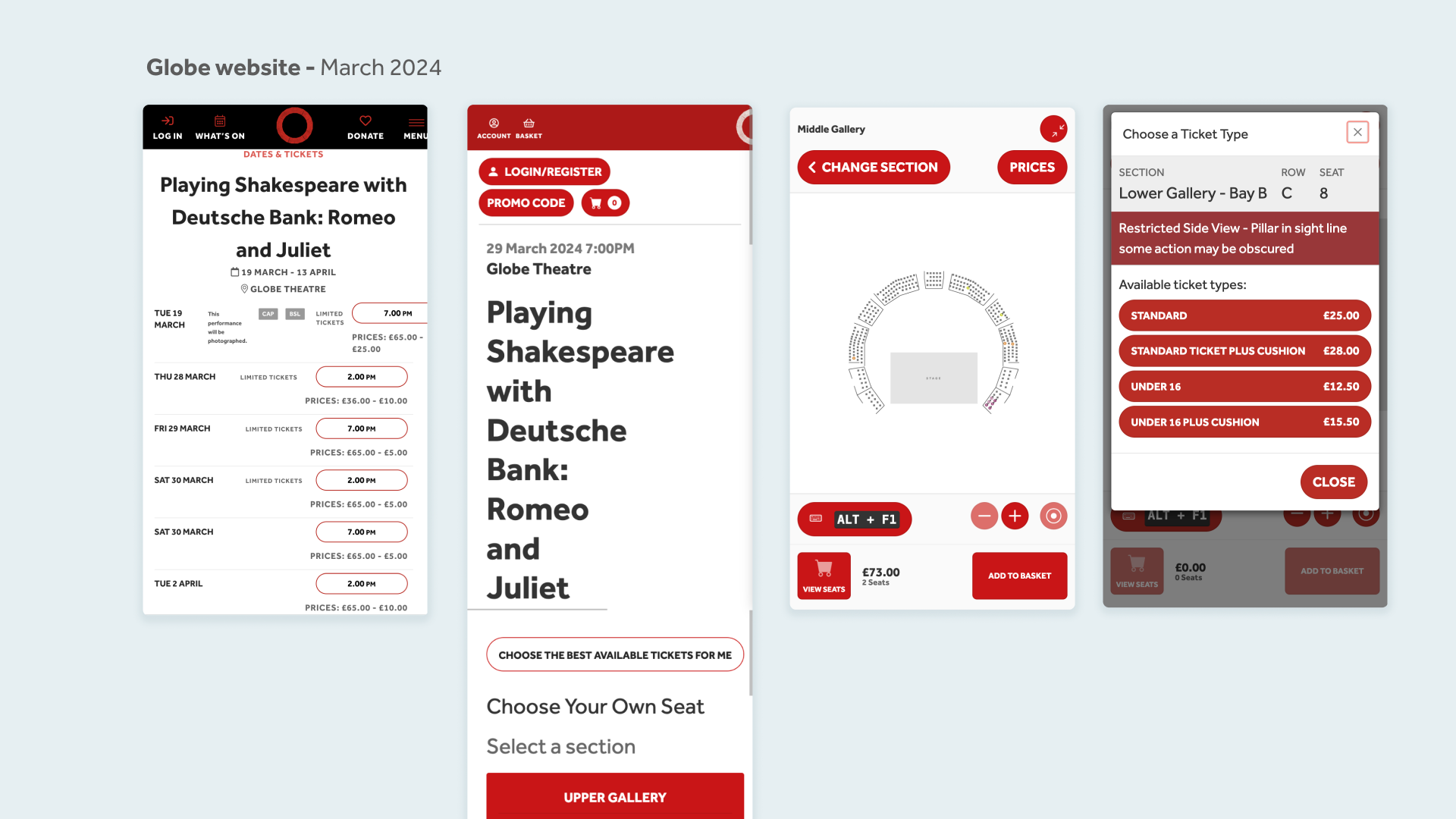
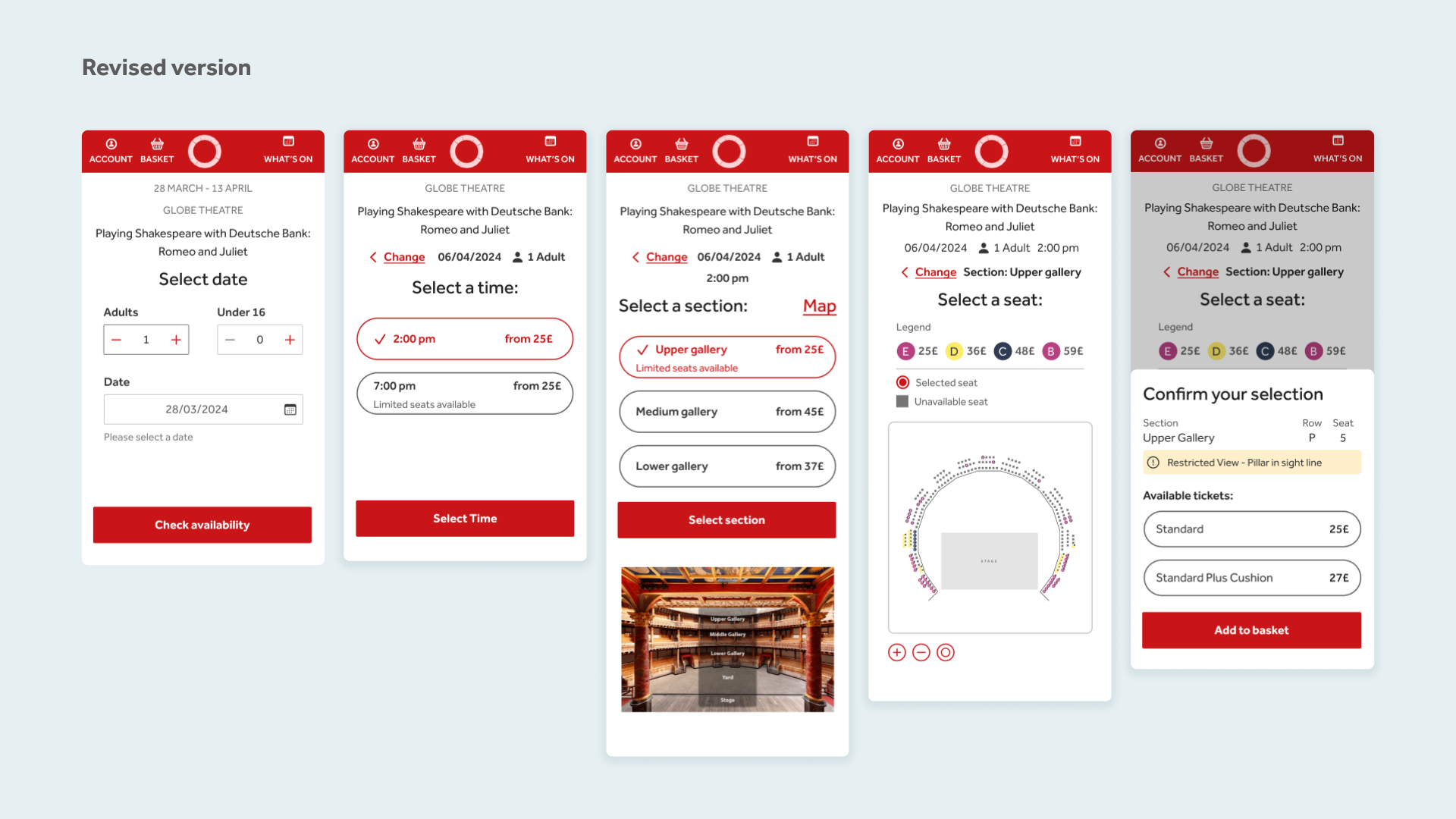
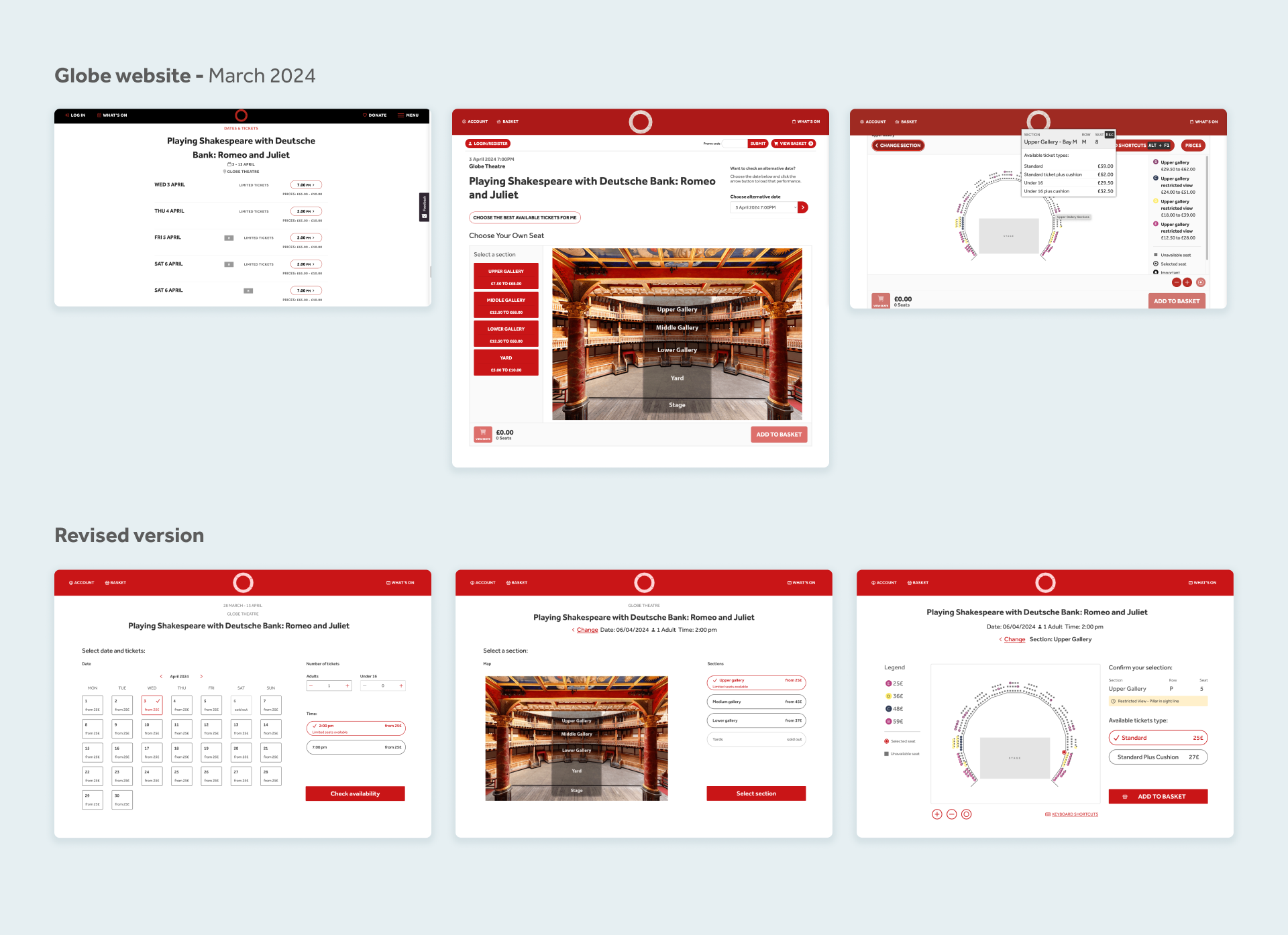
I began by selecting a primary user flow on the website—"Select a play and add seats to your basket"—for analysis. Following a design review, I identified areas for improvement, particularly regarding the clarity of the checkout process and the presentation of price information.
To validate these findings, I conducted remote usability testing sessions, wherein participants were asked to book tickets for "Romeo and Juliet" for a specific date within a set budget. Insights gleaned from these sessions highlighted user dissatisfaction with the cluttered layout and confusion surrounding price brackets.
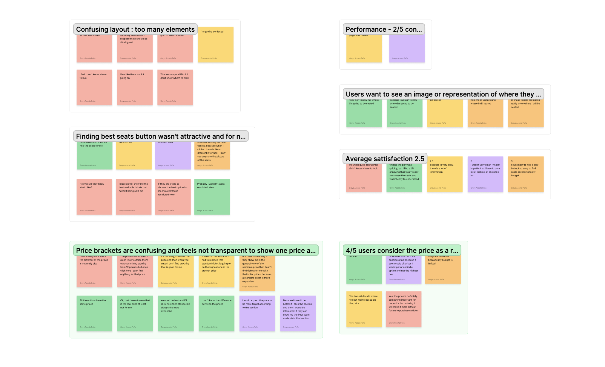
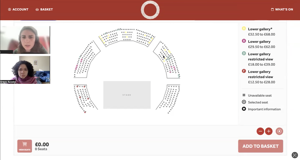
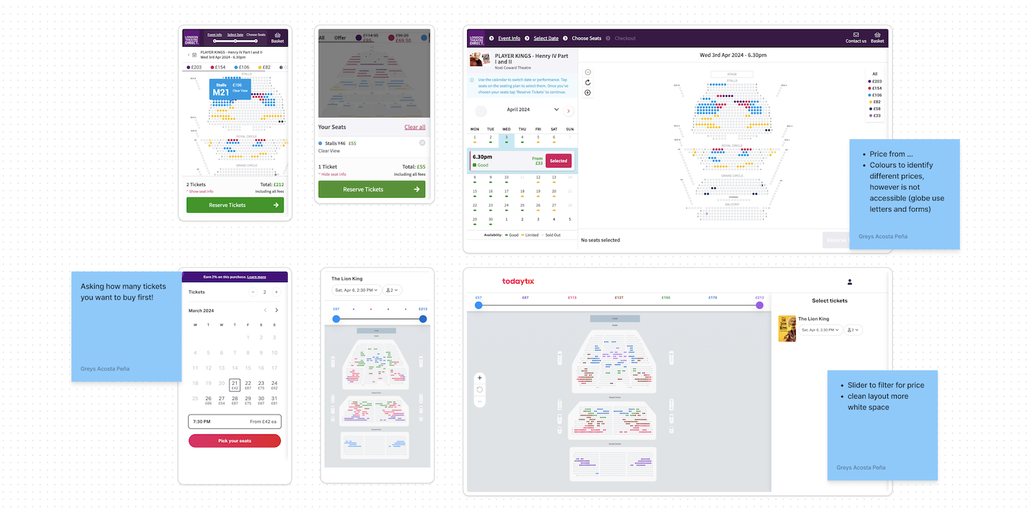
Based on user feedback, I prioritized addressing the "price bracket issue." Four out of five users indicated that pricing significantly influenced their decision-making process. Drawing inspiration from competitor analysis, I proposed a new flow wherein users would specify the number of adult and under-16 tickets, simplifying the presentation of pricing accordingly.
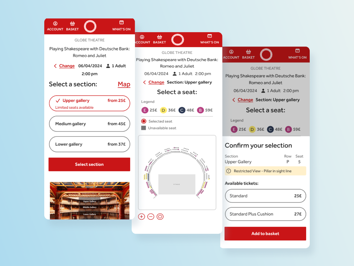
Utilizing low-fidelity wireframes created with Figjam, I iterated on the proposed flow, initially focusing on mobile screens before transitioning to desktop layouts. Notably, I refined the seat selection screen based on feedback from usability testing.
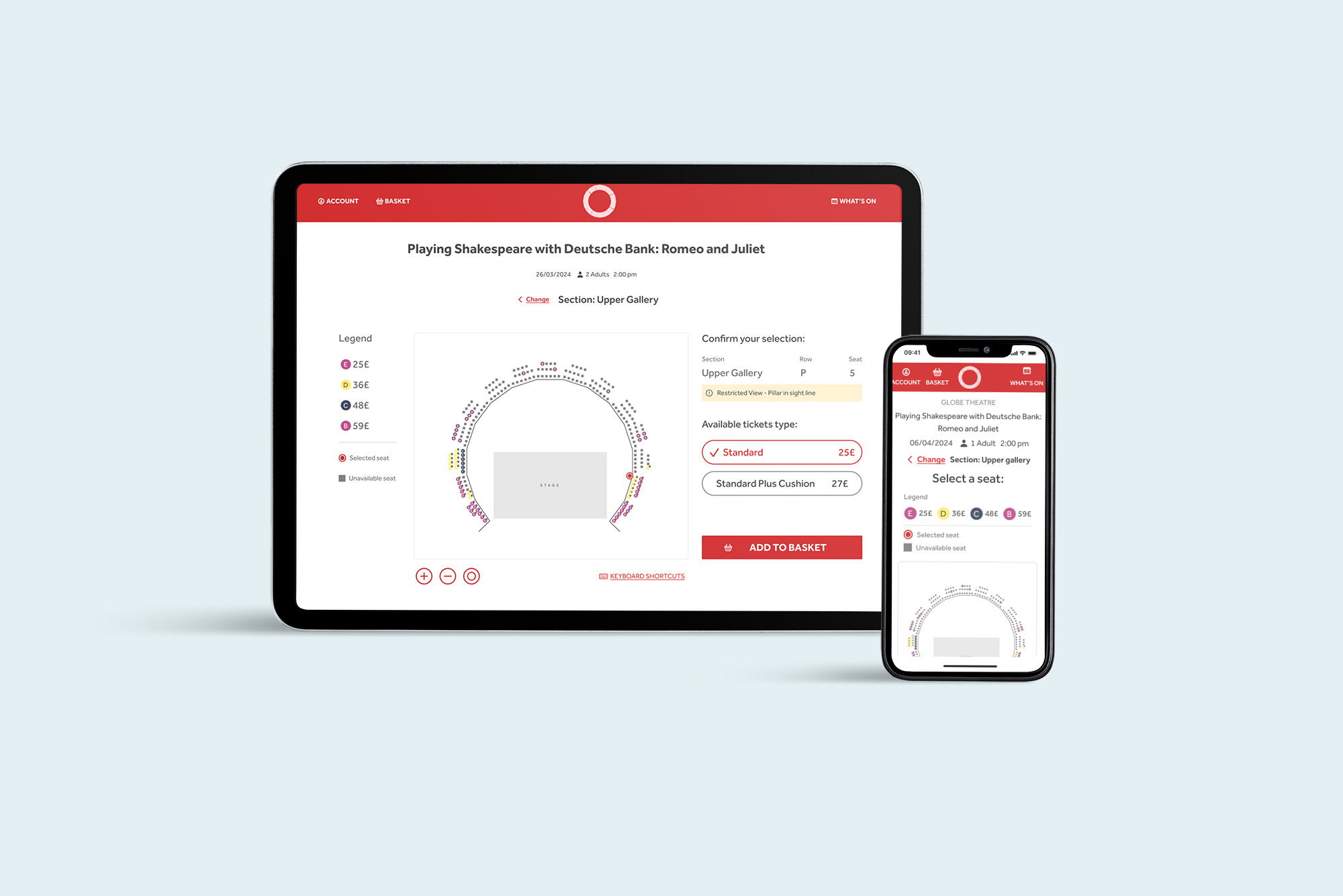
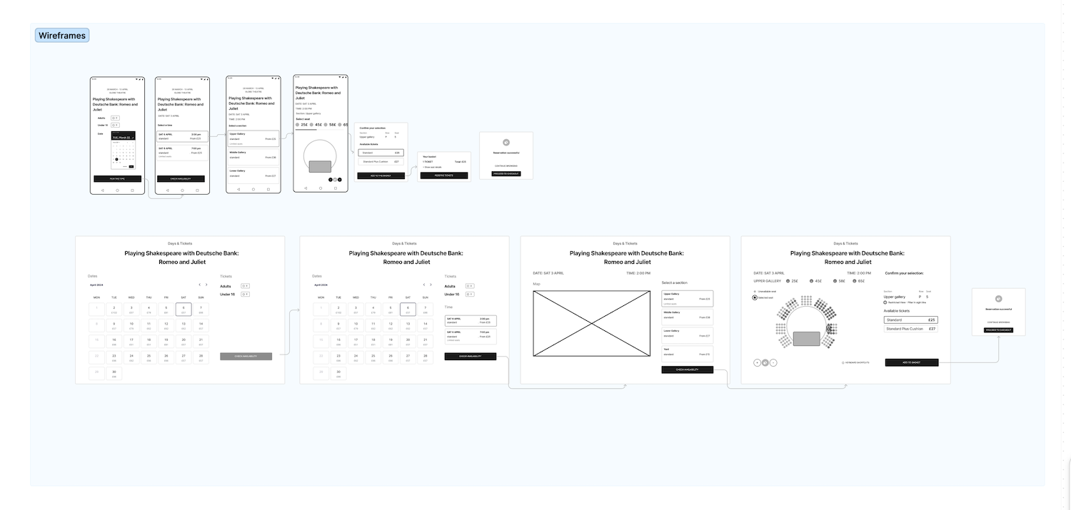 Take a closer look to the flow and wireframes in Figjam
One of the most challenging screens during the usability testing was the one to select a seat. So, I decided to start moving to high fidelity from this screen and decided to create a preference test to quickly validate design decisions.
In the test the users were asked what design they preferred and the reasons why. were significantly better for the new design. 14 of 15 users selected the new design mainly because they said the layout was more clear to understand and overall aesthetics suited their taste.
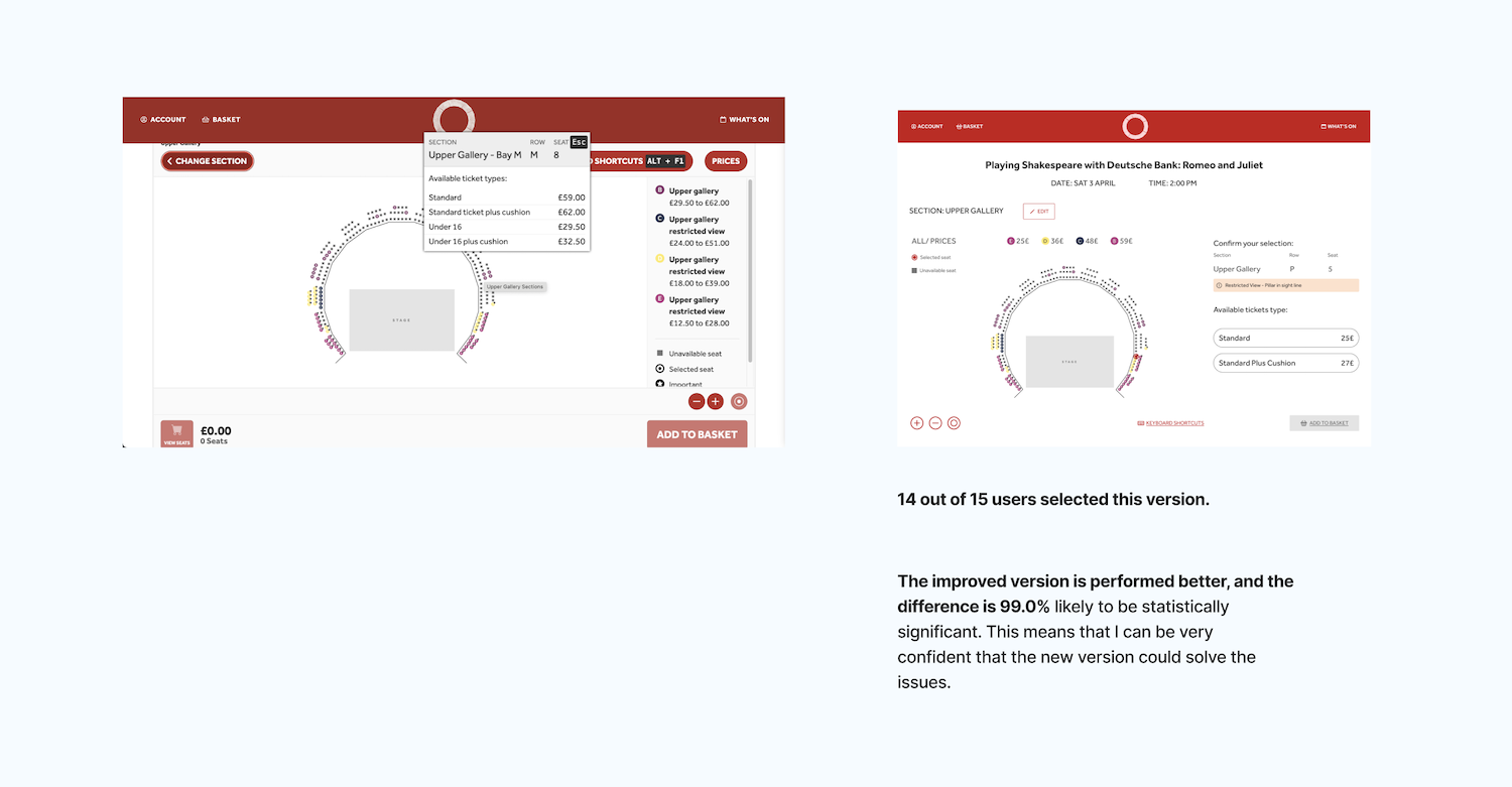
Take a closer look to the test results in Lyssna hub
Then after collecting this positive feedback I continued working on improving the new version by adding a clear colour to the call to action and finalising the layout structure.
The final product was a prototype of the mobile screens for the new flow. This design conveyed my initial ideas of improving the display of the price and the flow by selecting the type of ticket first.
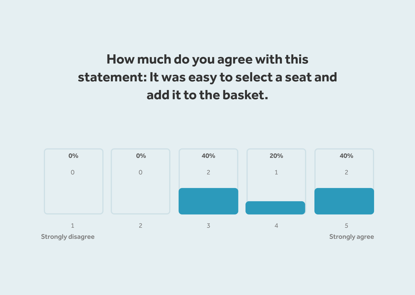
The prototype was tested using Lyssna to recruit 5 users from the United Kingdom between 25 and 65 years. Where I asked them to check the availability for a play, then add one seat to their basket from the upper gallery.
The results showed that 80% of users (4-5) were able to successfully complete the task. In conclusion, participants rated an average of 4 out of 5 in agreement with the statement: "It was easy to select a seat and add it to the basket.
As a first step I think it could be a good opportunity to create an A/B test to try the new way to display the prices and see if this has an effect on the conversion rates. For future steps, I could propose to continue testing and improving the new flow before implementing it.
If you like what you see and want to work together, get in touch!
greyspacosta@gmail.com